nes-ui-react is the most comprehensive retro UI library for React JS. It is based on NES.css, but refactored and bug-fixed.
This framework can also be used "CSS-only". Every class is global, but scoped ("nes-ui"). The npm package contains the source Sass files together with bundled CSS builds.
Features:
- Forked from NES.css, fully refactored
- Modern Sass and TypeScript
- Dark and light mode
- NTSC color palette
- Simple grid layout (2, 3 and 4 columns)
- New styles and custom decoration
- Many new components!
- MIT licensed
If you'd like to see more features added or bug fixed, please consider becoming a contributor. You're welcome! :)
Installation
Simply run:
yarn add nes-ui-react
or:
npm install nes-ui-react
Usage
Just click on the following buttons to find the exact demo code:
Color Palette
NES UIs had a distinct color palette that you‘ll find implemented here.
They are also exported to TypeScript via the Colors enum:
| Hex Value | 0 | 1 | 2 | 3 | 4 | 5 | 6 | 7 | 8 | 9 | A | B | C | D | E | F |
|---|---|---|---|---|---|---|---|---|---|---|---|---|---|---|---|---|
| 0x00 | ||||||||||||||||
| 0x01 | ||||||||||||||||
| 0x02 | ||||||||||||||||
| 0x03 |
The color name is a combination of the row index followed by the column index. e.g.: 0, 1, 2 or 3 in combination with 0 to 9 or A to F:
color38
color2C
color35
The whole plallete is based on the official NES color palette.
Named colors
The NES color palette comes handy for picking artistic colors. However there are also some named colors which are brighter and don't collide with the palette:
primarydisabledsuccesswarningerrorComponents
The library consists of typical, anachronistic and futuristic NES-style UI components. Every component comes with limited functionality that helps limiting the risk to introduce too much modern flavor.
<Hero variant="dash">
Hero components are used to present content that should attract the users attention first. You can choose from a few border decorations.
<Hr color="success" height="4">
Horizontal rulers are used to divide the UI horizontally. They can be configured to have different color and height in pixel.
<Container> & Content Alignment
<Container align="center">
title + content center algined because of align="center"<Container align="right">
title + content aligned right<Container roundedCorners alignTitle="center">
rounded corners, title aligned center, but content aligned left (default)Grid layouts with <Row> and <Col>
Typography
<Text>
Typography is simple: There is text or headings. Every paragraph becomes a <Text>. A text can be centered, have a color and a size.
size="small"
size="medium"
size="large"
size="xlarge"
color="primary"
color="success"
color="warning"
color="error"
color="disabled"
<Heading>
<Heading> however behaves exactly like a text, but is 25% bigger and size="xlarge" is underlined. Headings also have spacing that can be controlled with the attributes: dense, topBr, bottomBr.
size="small"
size="medium"
size="large"
size="xlarge"
color="primary"
color="success"
color="warning"
color="error"
color="disabled"
<Badge>
Badges indicate a status, or can represent hash tags, categories etc. The fontColor and bgColor attributes control the colors:
PrimaryErrorWarningSuccess<BadgeSplitted>
Sometimes, a tuple of status information shall be displayed. Here, a splitted badge comes in handy. bgColorLeft and textLeft control the left-hand design:
100%OK!!Oh!??Ha?:)Yay!<PixelIcon>
PixelIcons are small images with a canvas size of 8x8, 16x16 or 32x32 pixels. They automatically invert their color when displayed in dark mode, therefore they look best when drawn in monochrome base color #000000.
Sizes:
- small: 16 px
- medium: 24 px
- large: 32 px
Pixel width + height: 1 px
> Create your own PixelIcons with kyr0 @ PixilArt.comNote that icons look most nostalgic when you draw them in 8x8 pixel raster, monochrome.
Pixelart (PNG, JPG, ...) to SVG converter
Once you've created such an Icon, you'd probably like to convert it into such an base64-inlined icon CSS class as we usually do. Just drag and drop the PNG file here:
Pixelated Images
Pixelated images can be easily drawn using pixel drawing tools. We recommend Pixilart.com. If you're using Pixilart, the NES color palette has already been created: NES Color Palette.
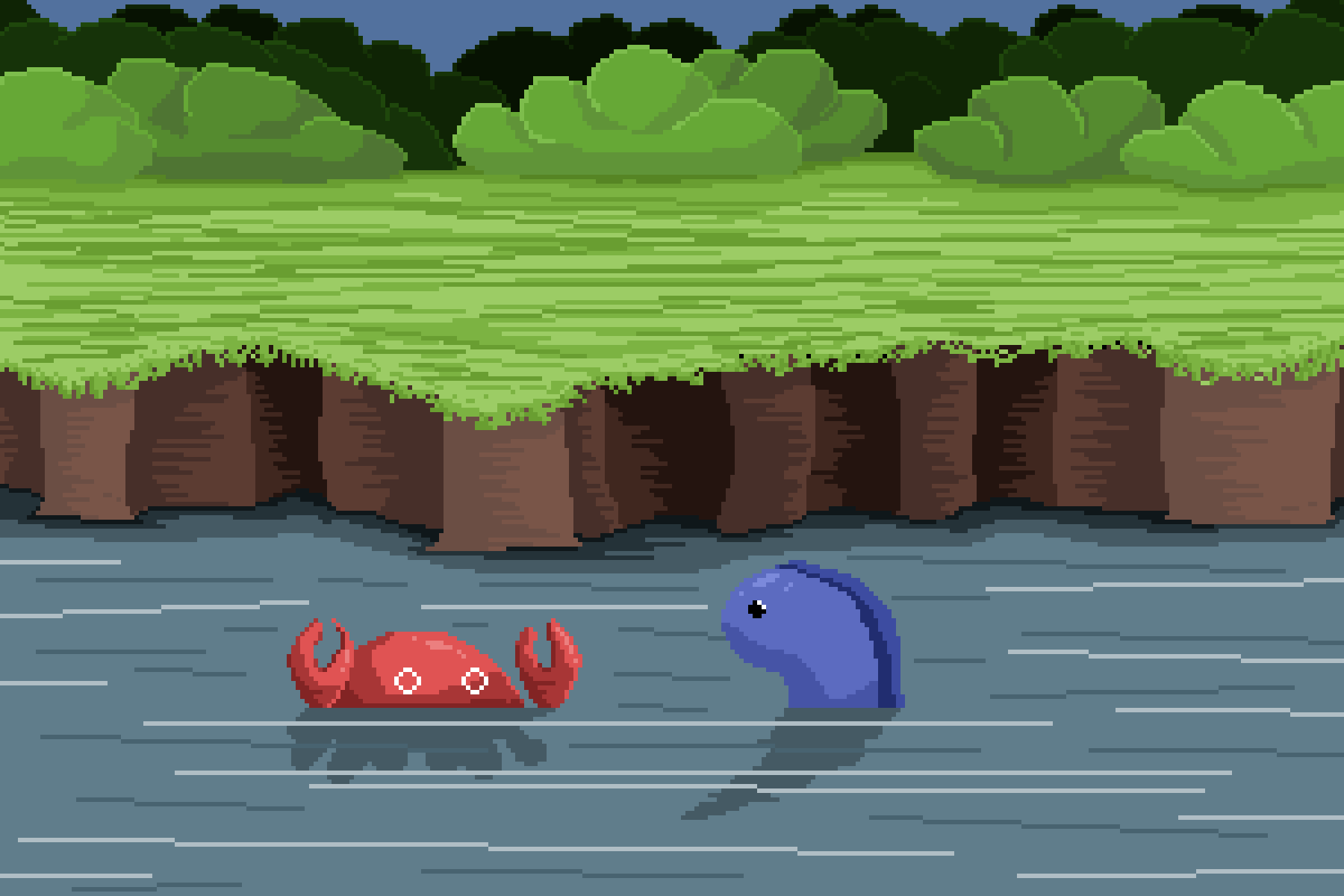 created by @yowack
Scaling imagex 2x with: .nes-ui-scale-2x
Inverting image colors with: .nes-ui-is-inverted
The color of any element can be inverted using the CSS helper class .nes-ui-is-inverted:
created by @yowack<Button>
Buttons can be created in different colors and sizes:
Small buttons:
<IconButton>
Buttons that only consist of icons are used in Toolbars and Menus. For a perfect shape, the PixelIcon size needs to match the desired button size (32px, 24px or 16px):
Such icon buttons can also be composed of icons and text:
Medium size:
Large size:
<Radio>
<Checkbox>
Can be disabled too:
<Input color="error">
<TextArea color="success" rows="3">
<Toast bubblePostion="right">
<Select>
<List styleType="disc">
Circle list:
- Wake up
- Skip school
- Turn on the C64
- Sleep
Disc list:
- Wake up
- Skip school
- Turn on the C64
- Sleep
<Table>
Left-aligned, borderless:
| A | B | C | D |
|---|---|---|---|
| Funny | Games | Are made | of 8 bits |
| Good | Players | dream in | 8 bit |
Centered, with borders:
| A | B | C | D |
|---|---|---|---|
| Funny | Games | Are made | of 8 bits |
| Good | Players | dream in | 8 bit |
<Progress value="20" max="100" color="success" />
<PixelBorder>
The PixelBorder component allows to draw a pixelated border around any element.
<PixelBorder />
<PixelBorder doubleSize />
<PixelBorder doubleRoundCorners />
<PixelBorder doubleSize doubleRoundCorners />
<Toolbar>
Toolbars are used to group buttons together. They can be used to create a navigation bar, an action toolbar, or in combination with <Header> or <Footer>:
Borderless & with edged corners
<Menu>
Menus are a great UI choice whenever a single button is not enough. They can be used to create a dropdown menu or a context menu.
Dropdown menu
<Modal>’s
Modals allow for opening custom dialogs and prompts as an overlay. They are typically used together with <ModalContent>, <Header> and <Footer>.
The properties open and onClose are relevant for controlling the presentation state. With backdrop and backdropClose, the background of the modal can be disabled and the modal can be closed by clicking on it.